


The Art of Colour: Practical Applications in Art Direction and Brand Storytelling #3
How to bring your colour choices to life in campaigns

Hi everyone,
Hope you’re doing well and have not forgotten about my Art of Colour series yet! I’ve loved hearing your feedback on the first two posts, thank you for your thoughts and messages. It took me a while to write the third one, as I feel like I could write endless posts on colour and it’s been quite challenging to break down this subject and what the order was going to be. It’s been sitting in my drafts for weeks, maybe even months.
Also I am so excited by the first guided art direction briefing I kicked off on Saturday. I am providing paid subscribers with an industry format creative briefing and a template, in which you can share your art direction concepts and I will provide personalised feedback and guidance. It’s a great way to practice your skills and all the theory I have been sharing in my newsletter. Each idea provides a different way of presenting and taking the receiver on a journey, balancing providing lots of information vs. teasing the idea and giving them a little bit a the time. I am so excited how everyone so far has adapted the brief to something that feels personal to them, while still staying on brief. You can still join and jump in any moment this month, I will try to give feedback with 48 hours.
Today, we’re diving into the final part of The Art of Colour series, focusing on how to use colour intentionally across all aspects of a campaign. While this wraps up the series, I see it as a simplified guide to help you get started with choosing colours for your projects.
Colour is more than just a mood or cultural statement. It is a storytelling tool that needs to be applied cohesively across every element, from set design to web and print. This post focuses on bridging theory and execution.
If you are new here, I recommend starting with Part 1 and Part 2 [linked down below]. In Part 1, we explored how to choose colours by considering the target group, product, season, brand values, and trends. Part 2 looked at the history and cultural context of colour and what to keep in mind when planning a campaign.
Now, in Part 3, the focus is on practical applications of colour during the (pre)production phase. Each campaign has a different starting point, and this post builds on the earlier ones by showing how colour is applied holistically across brand communication. At the end, I will also share two case studies.
Let’s get into the practical ways colour can transform your art direction.


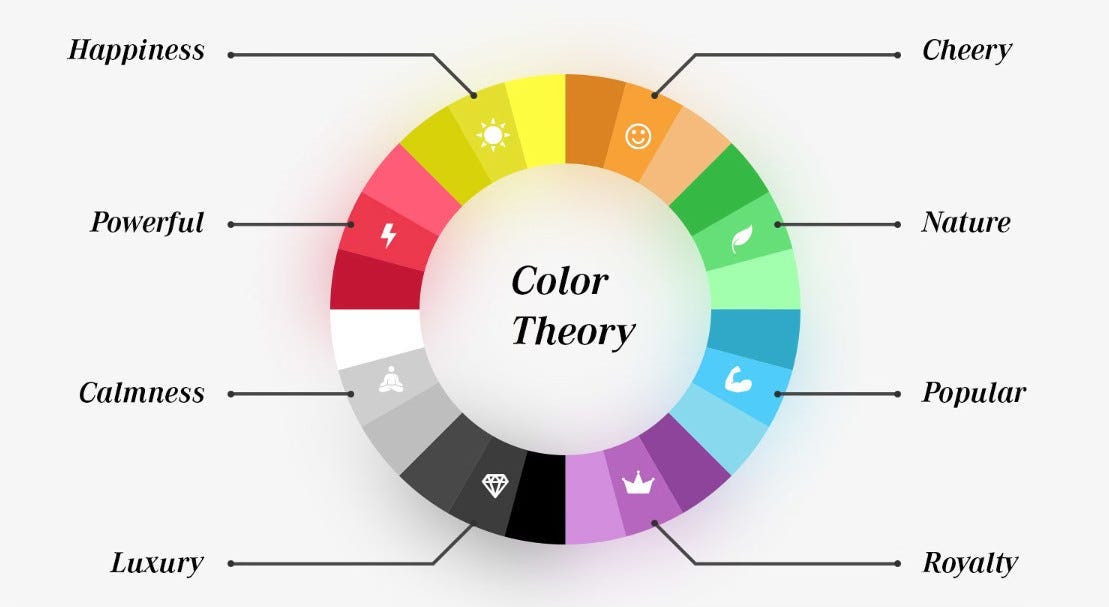
Starting off with sharing a basic colour theory wheel often used in marketing. This is ofcourse quite top level, as different shades and nuances of one colour communicate different meanings. It’s always interesting to keep this in mind.
Set Design: Adding Depth with Texture and Shades
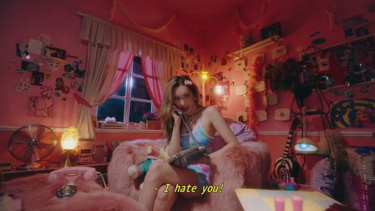
Set design is one of the most visually impactful ways to use colour. Textures and shades can add richness to a campaign, but the type of shade you choose can also determine whether it feels luxurious, youthful, or basic. Set design doesn’t have to be a set build from scratch, it can also be set dressing. Imagine a teenage bedroom covered in pink and pastel colours, if you change the wall colours and the bedding to black, the whole story has a different narrative and mood.
Let’s use yellow as an example, and how a certain shade of one colour can also change the context:
A bright, primary yellow often feels playful and works well for children’s campaigns.
A softer yellow feels more approachable and casual and youthful.
A deep ochre yellow exudes richness and sophistication, fitting for a luxury fashion shoot or an editorial piece.


Textures also play a huge role. Velvet in rich tones adds a sense of opulence, while matte backdrops in muted colours feel understated and modern. Pairing colour with texture lets you build a world that feels tactile and immersive, drawing people into your story. This is always super important to keep in mind when picking your colours for the set design!
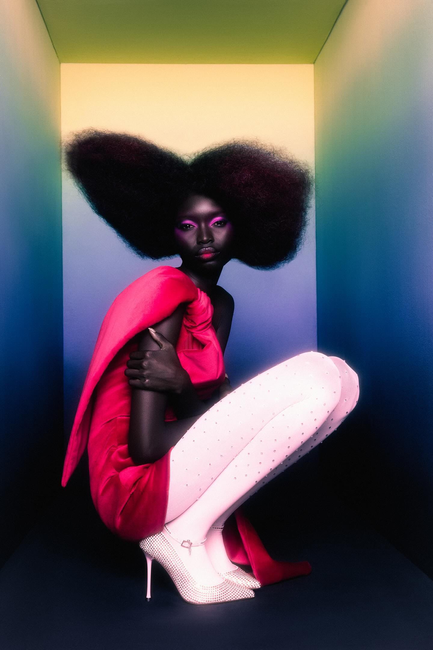
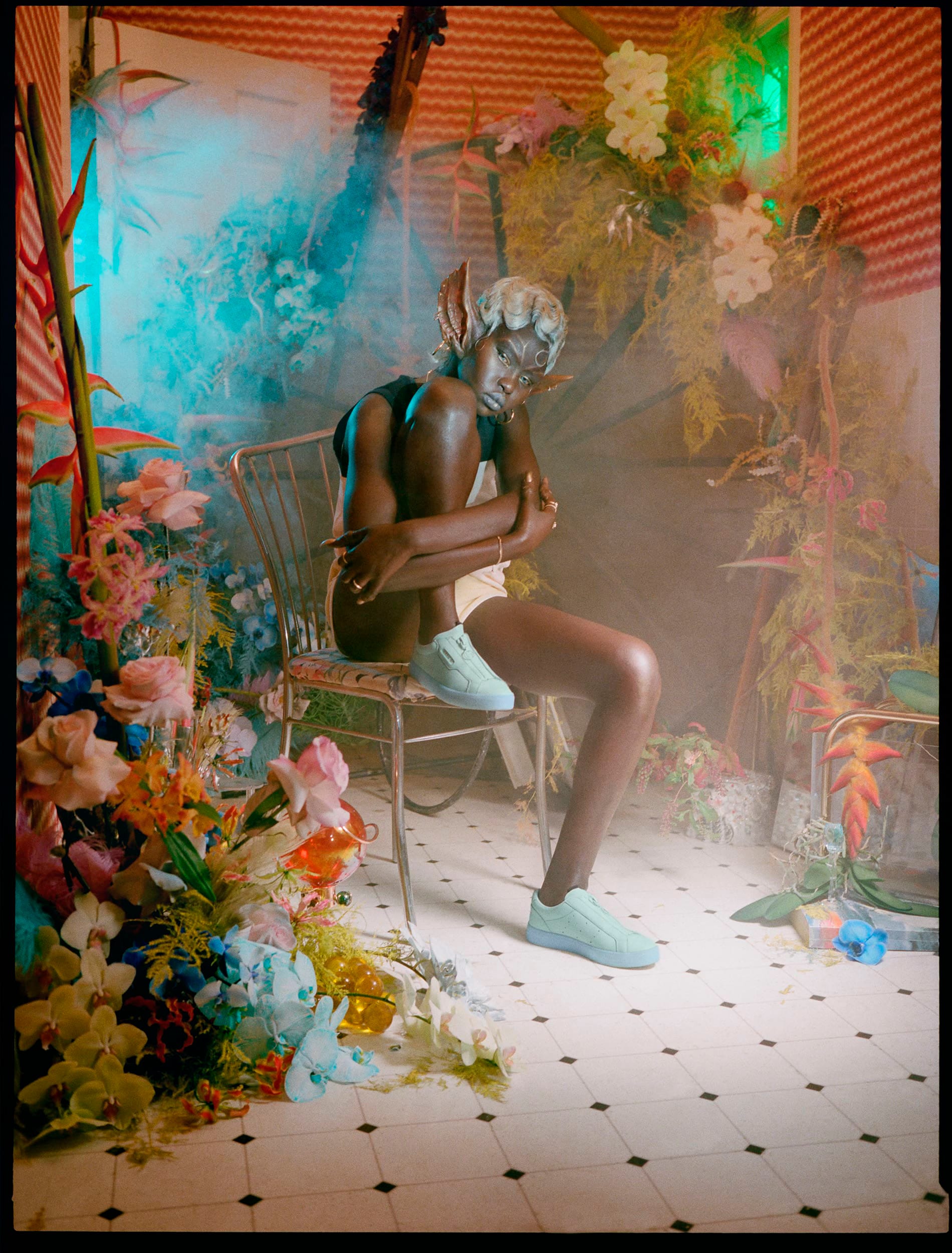
Lighting: Shades, Darkness, and the Power of Contrast
Lighting can completely transform how colours are perceived. Even the most vibrant shades can feel muted under soft lighting, while bold lighting can heighten the intensity of neutral tones. Here are a few things to consider:
Dark vs. Light Shades: A dimly lit scene with rich, dark tones (think burgundy, chocolate, ochre yellow) can feel intimate and dramatic, while a brightly lit setup with lighter shades creates a sense of openness and positivity.

Dark shades and dramatic light by Gabriel Moses Colour Lighting: Using coloured lights (like neon or gels) can add unexpected depth to a campaign. Imagine a soft pink glow over a beige set, suddenly, the colours feel more vibrant and modern. It is an easy way to bring in movement within your static scene. You can use colour lighting to create colour gradients that slightly differ per image or to create contrast.

Coloured lighting by Sophia Mulder The Number of Colours: A limited colour palette (e.g., two or three complementary shades) creates a refined, minimalist feel. On the other hand, colour blocking with bold contrasts or using an abundance of colours can feel playful, high-energy, or even chaotic, depending on the execution.

by Petra Collins

Applying Colour to Web and Print: The CMYK vs. RGB Debate
When your campaign moves beyond physical spaces to digital or printed formats, colour standards matter. This is something to keep in mind when creating your final outcomes and how the post production might affect the final outcome.
CMYK for Print: Colours often appear slightly muted when printed, as they’re created by mixing cyan, magenta, yellow, and black. This can affect how vibrant your campaign looks in print. Always test your colours beforehand to ensure they translate as intended.
RGB for Web: Digital platforms use red, green, and blue light to create colours, resulting in much brighter and more vibrant visuals. However, what looks great on screen might not feel cohesive if it’s inconsistent with printed or physical elements.
Consistency is key. If your campaign spans both web and print, it’s worth tailoring your palette slightly to suit each medium without losing the overall tone.


The Balance of Colour: Finding What Works for Your Story
The way you balance colours across a campaign can completely shift the narrative.
Monochromatic Palettes: Using a single hue in varying shades can feel cohesive and sophisticated, especially for high-end brands or minimalist campaigns.

Courreges Spring 2024 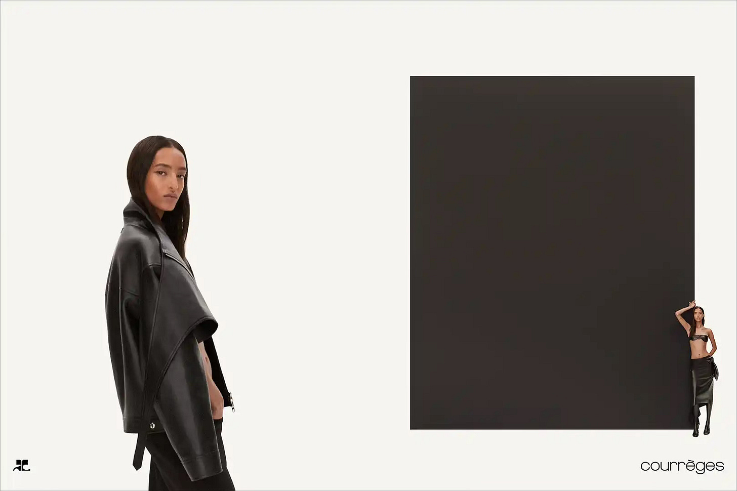
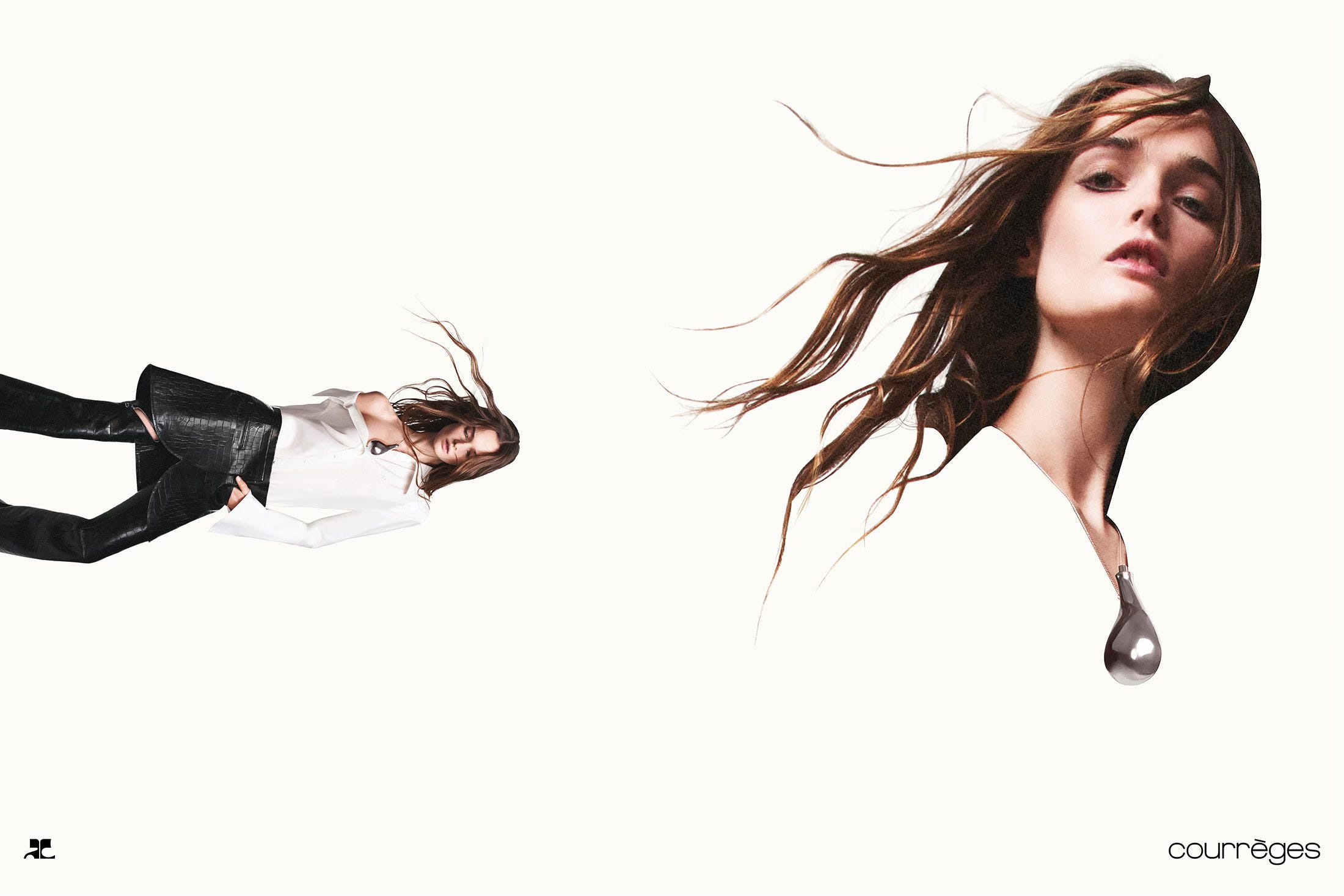
Courreges Fall 2024 Contrasts and Colour Blocking: Bold contrasts create energy and drama, perfect for streetwear or editorial campaigns. Colour blocking with clean separations adds structure and clarity, especially in graphic design.

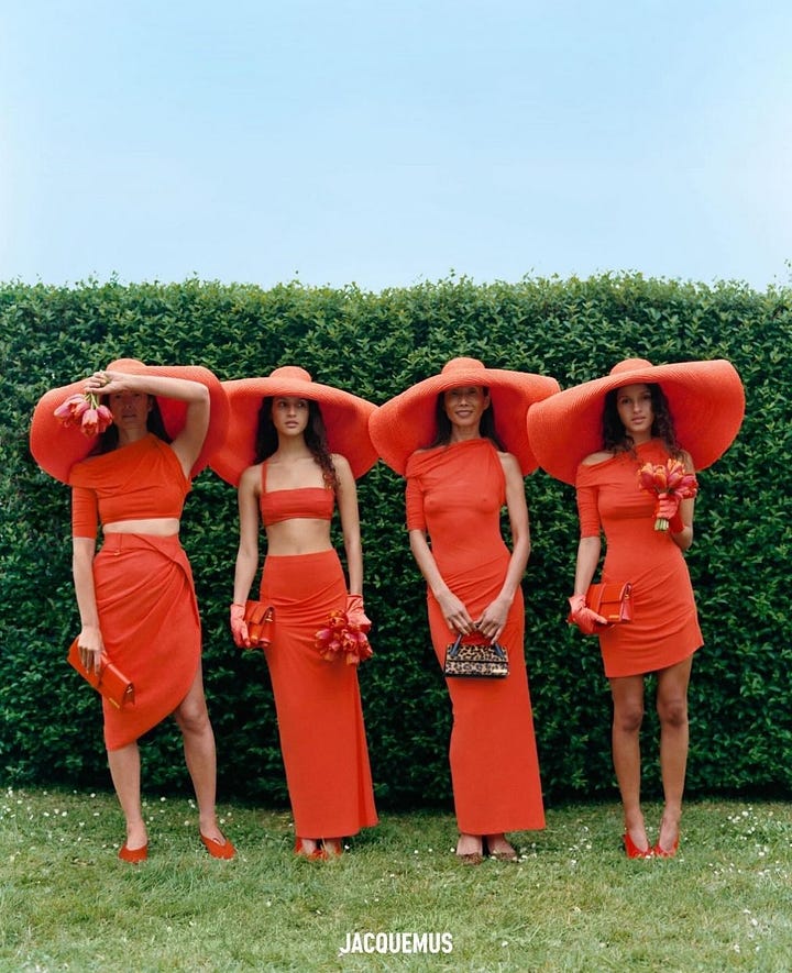
Jacquemus 
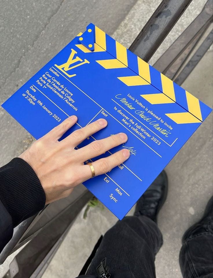
Louis Vuitton Men’s FW23 Show Invitation An Abundance of Colours: Using a wide range of colours can work beautifully for campaigns that celebrate diversity, inclusivity, or creativity. However, balance is crucial, it’s easy for this approach to feel overwhelming if not carefully curated.


Conclusion: Intentional Colour, Everywhere
Colour is everywhere in a campaign, from the set design to the lighting, the product to the typography, and even the final output on a screen or in print. By being intentional with every application, you can create a campaign that not only looks cohesive but also feels like a story your audience wants to step into.
In the next section, I’ll share two examples for paid subscribers that show how brands have brought colour to life in their campaigns.
As a paid subscriber you also get access to my full archive of articles, personal guidance with industry briefs and art direction projects (for all disciplines), access to paid subscriber threads and a community, occasionally I open up for consult for personal projects and portfolio sessions and much more..


