

The Art of Colour: A Guide to Choosing and Using Colours in Creative Campaigns #1
Exploring how to make intentional colour choices for emotional impact and effective storytelling.

The Art Direction Newsletter finally arrived to Instagram. Here I hope to inspire and update you on your feeds with editorial- and brand inspiration and the newest posts. Once I have grown on Instagram, I’ll be very excited to start a broadcast community to give more current art direction observations of brands and short form content. So please give it a follow! ❤️
Hi everyone, hope you’re all having lovely weekends. I am having some downtime and rewinding and preparing some draft posts for mid October until mid November as I will be travelling a lot and don’t want to miss out on posting newsletters. I’m very excited, because I will be going to Los Angeles, Paris and Seoul so am also brainstorming on how I can share inspiring content from these trips.
This week’s newsletter will be about colours. A topic I have been wanting to talk about, but I feel like you could start an entire newsletter just on this topic and have been struggling to structure my research and insights and how I will be breaking this down. I decided to turn this into a 3-part series, with each post starting with educational knowledge and ending it with an exclusive part for paid subscribers that includes a colour case study with references and mood boards.
Part 1: Introduction to Choosing Colours and Emotional Impact
Part 2: Context, Trends, and Cultural Influence on Colour Usage
Part 3: Practical Applications in Art Direction and Brand Storytelling
An Introduction to Choosing Colours and Its Emotional Impact
As an art director, selecting the right colours for a campaign is one of the most powerful tools at your disposal. Whether you’re creating a visual language for a brand that lacks an iconic colour or you’re tasked with making colour the focal point of a project, choosing the right palette is essential. In this part, we'll explore key factors to help you make intentional colour decisions that align perfectly with your campaign's goals.
There are quite literally endless colours on this planet, different shades, more muted, saturated, bright and then don’t even get me started on the combinations. I had times where finding the right combination felt extremely overwhelming. Especially when you have to sell in your choices to the client, your creative directors and the rest of the team. Having a strong rationale on why you chose certain colours, so everything feels logical gives less room for the person who needs to approve it to say no. If you present a colour combination, because it simply feels right everyone’s personal taste and opinion will take over. We want to avoid this at all costs, of course.
Below I am sharing a couple of starting points that you could research or simply look at when you feel overwhelmed with your colour selection. A strategic understanding of the colours help shape the overall narrative and emotional tone of your project. These foundational elements below can help guide your choices and build your rationale based on the campaign’s purpose, audience and broader cultural context.
1. Target Audience
Understanding the audience is the cornerstone of any creative decision, and colour is no exception.
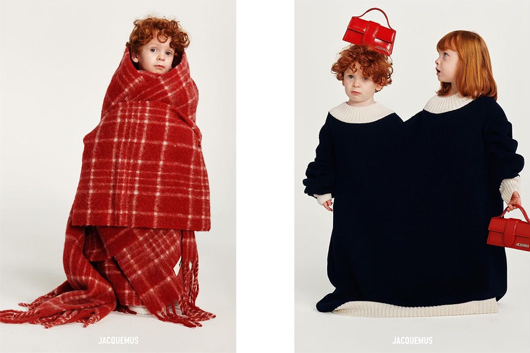
Demographics: The age, gender, cultural background, and preferences of your target audience should inform your colour palette. Vibrant, playful colours may resonate strongly with a younger audience, suggesting energy and excitement, while classic, muted tones often appeal to an older, more refined demographic, evoking sophistication.
Cultural Considerations: Colours carry diverse meanings across different cultures, which can significantly impact audience perception. For example, red may symbolize luck and prosperity in some cultures, while in others, it may signify caution or even danger. Being mindful of these cultural nuances allows you to connect more deeply with your intended audience.
2. Product Focus
The focal point of your campaign—the product itself—plays a crucial role in determining the colour direction.
Complementing the Product: When the product is the hero, selecting complementary colours can enhance its visibility and appeal without overshadowing it. For instance, a vibrant red lipstick can be showcased effectively against a neutral background to make it pop.
Contrasting for Impact: Alternatively, if the goal is to make a bold visual statement, using contrasting colours can create striking visual tension and immediately draw attention. A green product set against a purple backdrop is an example of a contrast that ensures the product becomes the focal point.
3. Seasonality
Colour should reflect and evoke the seasonal context of the campaign, enhancing the emotional resonance of the visuals.
Spring/Summer: Light, bright, and airy colours such as pastels and vivid greens evoke warmth, renewal, and freshness—perfect for spring and summer campaigns that want to align with these seasonal characteristics.
Autumn/Winter: Rich, deep colours like burnt oranges, browns, and darker greens convey a sense of warmth, comfort, and depth, aligning well with the sentiments of fall and winter collections.
4. Product Features and Brand Personality
The intrinsic qualities of the product, as well as the overarching personality of the brand, heavily influence the selection of colours.
Luxury vs. Youthfulness: Luxury products often demand a palette of richer, darker colours—such as deep blues, golds, and blacks—to evoke exclusivity, sophistication, and timelessness. In contrast, youthful brands may benefit from more vibrant and playful colours like electric pinks and bold oranges to convey energy and a sense of fun.
Product Characteristics: The inherent attributes of the product also play a role. A lightweight, fresh product might call for colours that are soft and airy—like pale blues or translucent hues—whereas a high-performance, fast product might be best represented with vibrant reds or sleek metallics.
5. Brand Values
The brand’s core values should also be a guiding factor in the colour selection process, helping convey what the brand stands for.
Sustainability and Nature: Brands that focus on sustainability and a connection to nature can benefit from earthy tones, such as greens, browns, and muted neutrals, which communicate environmental consciousness and authenticity.
Trust and Transparency: Colours like blue are often associated with reliability, stability, and trust—making them an ideal choice for brands that value transparency and building consumer trust.
6. Colour Trends and Zeitgeist
Aligning with cultural trends and the zeitgeist ensures that your campaign feels contemporary and relevant, positioning the brand as attuned to the current cultural landscape.
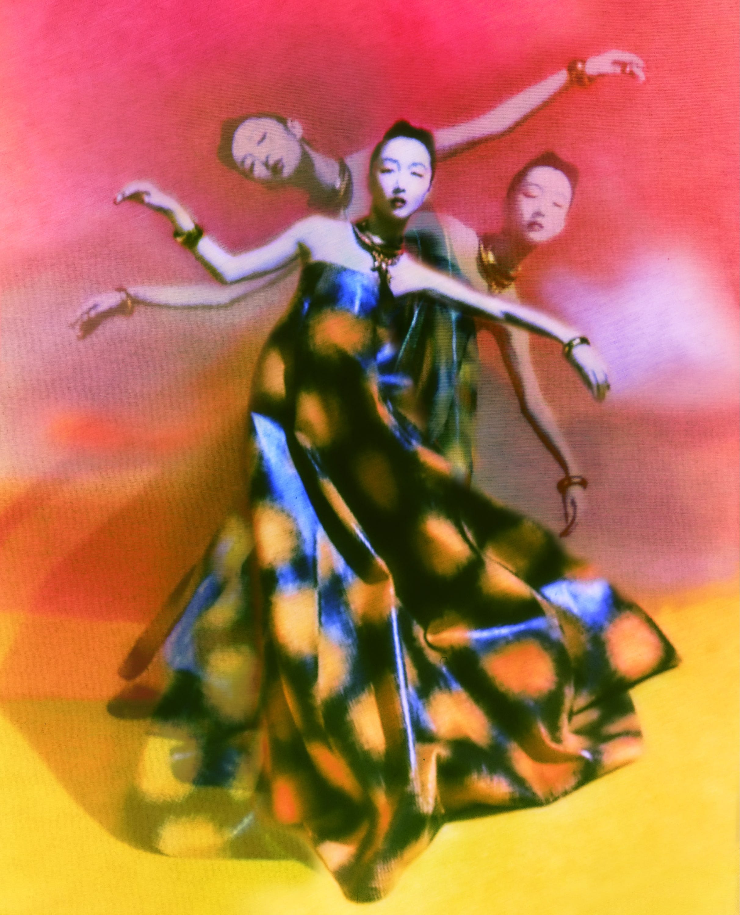
Trendy Colours: Colours that are inspired by recent fashion shows, pop culture, or art movements can reflect the spirit of the times, making your campaign feel fresh and up-to-date. This alignment helps brands connect with consumers who are immersed in and influenced by these cultural currents.
Nostalgia: Leveraging nostalgic colour palettes can evoke emotional connections, especially if the brand aims to tap into familiar and comforting associations. For instance, the use of muted pinks and blues reminiscent of the 90s can create a sense of retro familiarity that appeals to audiences seeking a connection to the past.
How Colour Affects Emotions and Perception
Colour is an emotional language in itself. The choices you make as an art director can evoke specific feelings and create a particular mood, ultimately shaping how viewers perceive the campaign. Of course, colours are paired with photography, styling, casting, typography and design but we can focus on all those elements later. Just looking purely at the colours, it does a really big job on the feeling it leaves behind.
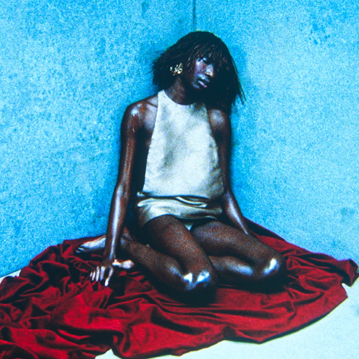
Warm vs. Cool Colours: Warm colours like red, orange, and yellow evoke energy, passion, and excitement, while cool colours like blue, green, and purple tend to evoke calmness, trust, and relaxation.
Associative Emotions: Each colour carries its own set of associations—red for urgency or passion, green for growth and nature, blue for calm and trust. Choosing colours that align with the campaign’s goals will help convey the intended message more clearly and effectively.
Conclusion for Part 1
Choosing the right colours for a campaign is about more than just aesthetics—it's about telling a story, resonating with the target audience, and evoking the right emotions. By considering factors like audience, product focus, seasonality, brand personality, and cultural trends, you can make informed choices that create a powerful visual impact.