The Art of Colour: Context, Trends, and Cultural Influence on Colour Usage #2
How context and culture shape the colours we choose
Hi everyone,
Hope you’re all doing well and have been enjoying the previous few posts. As you are reading this I am probably travelling and I have scheduled a couple of posts, so if I have been a bit slow to replying on my message requests on Substack or Instagram I promise I will get back to you and answer everything you need.
Today’s post is the second part of ‘The Art of Colour’ series. One I am very excited about, because I feel like I can talk endlessly about colours. The first post I created is a guide on choosing the right colours for your project and narrow down the overwhelm. I also end it with two case studies on colour combinations with mood boards and references in the world of fashion, interior, graphic design and product. I’ve gotten so many positive replies on it, so thank you a lot! ❤️
In this post we are diving in a bit more of a historical and cultural context and how trends shape the way we use colours. It’s one thing that red can feel powerful, but why is it that certain colours get a new meaning or suddenly feel right for a specific moment in time? That’s what I want to explore with you. I’ve piled my research and hope to share as much as I can, but as I said. Colours are a study on its own, it involves a lot of history, culture, zeitgeist, but also personal taste.
In the first part you will get the educational content available for everyone, the second part of the post is exclusive for paid subscribers where I will be sharing two in-depth case studies on colour in a cultural context.
Context is Everything: Why Colours Aren’t Chosen in Isolation
Colour is never just about what looks nice or what feels right. It’s so tied to the zeitgeist we live in. What colours mean changes all the time, depending on what’s happening in the world, what people care about, and even the things we’re nostalgic for. A pink that was once for boys, then girls, is now for everyone, the context makes all the difference. Even on a personal level, turquoise and brown seemed like the coolest colour combination in the 2010’s but now feels cringe and outdated.
Let’s dig into a few things that shape how we use and think about colour.
How Culture Shapes Colour Meanings Over Time
Think about how colours have changed through history. Pink is one of my favourite examples. Back in the 18th century, it was a strong, masculine colour. It was associated with power and wealth, the main reason being the innovation of chemical dye’s that made this shade available for the powerful and reach within textiles. It was King Louis XV of France’s favourite colour. Then, somewhere in the 20th century, it became all about femininity, partly because of how it was marketed. When we think Barbie, we think femininity and of course PINK. Now, we see pink being used in a much broader way, sometimes it’s about softness, sometimes it’s rebellious. Different shades of pink have different meanings as well.

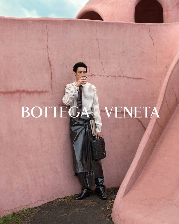
Or take neon colours in the 80s. That was not just a random choice. The bright neons reflected the bold, carefree mood of an economic boom. Everyone wanted to stand out, to be seen. Colour trends are always influenced by what’s happening in society, whether it’s good times or times of change.
Colours Mean Different Things in Different Places
Colours aren’t always universal, what they mean can be totally different depending on where you are. In Western culture, white is usually seen as pure, fresh, or new beginnings, which is why brides often wear it. But in some Eastern cultures, white is for mourning. Imagine using white in a campaign and accidentally giving the opposite message than what you intended.
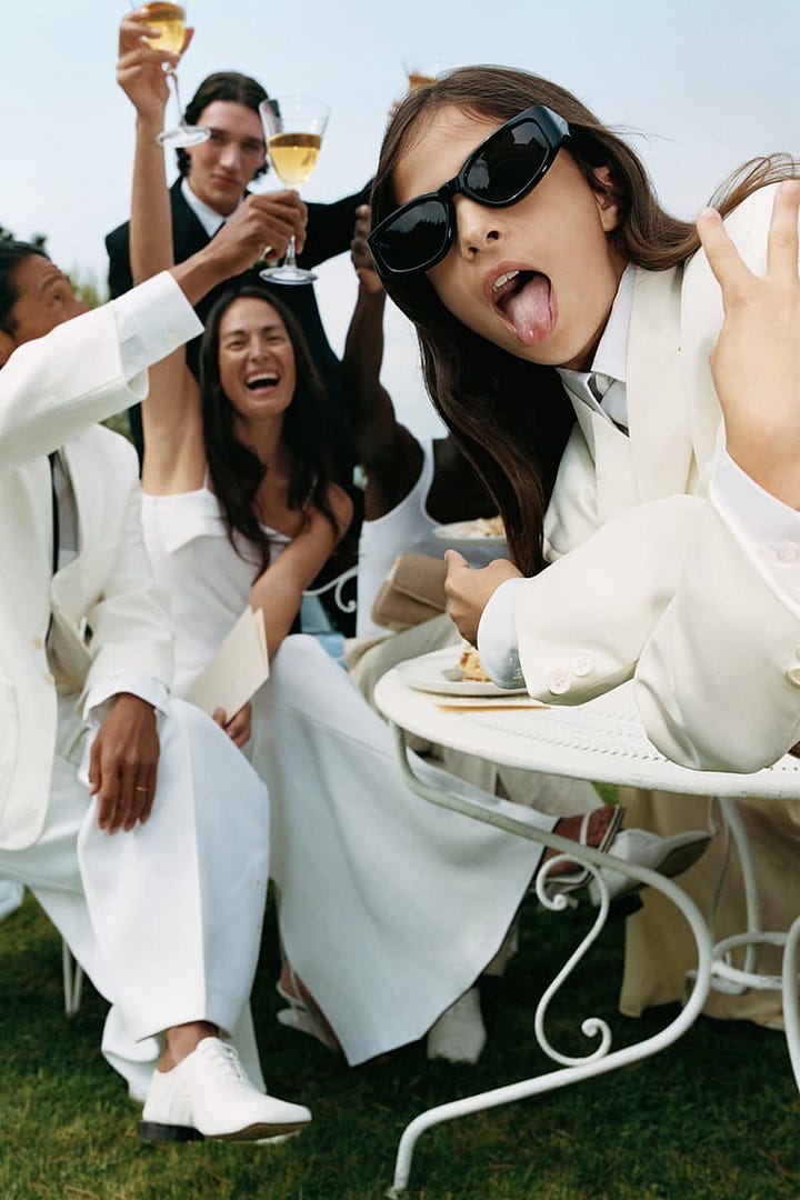
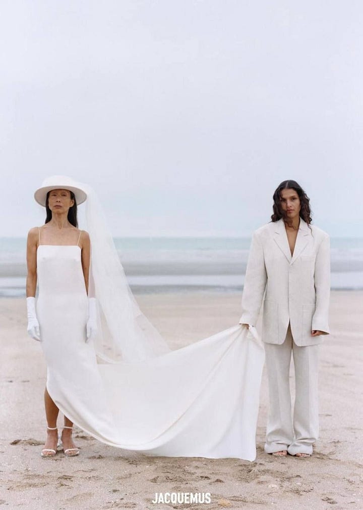
Red is another big one. In China, red is joyful, lucky, a colour for celebrations. But in many Western places, it’s about danger, power or urgency. The same red can mean two completely different things depending on the audience, and it’s so important to be mindful of these differences if you want your work to really connect. On global campaigns it is important to always take the key markets in consideration when making art direction choices (especially also in casting, but that is a different conversation!), especially right now living in a cancel culture where everyone has an opinion and access to all knowledge, you really need to sense check. This is also definitely the reason why some fashion campaigns can feel quite mundane when it is used for out of home on global reach, while the local campaigns, activations and editorial content can be much more bold and exciting. It all has to do with global market sensitivities.
How Trends and the Zeitgeist Influence Colours
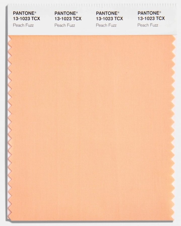
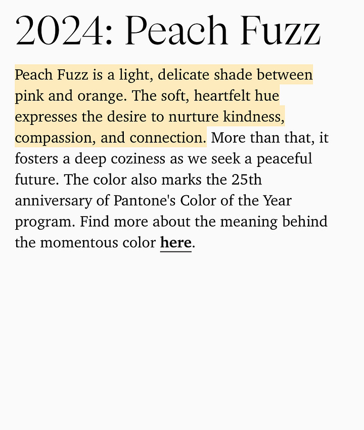
Colour trends are always changing, and they’re influenced by what’s happening around us in fashion, music, big cultural moments. You know how Pantone chooses a Colour of the Year? It’s not random. It’s about what’s in the air, the feelings that people are tapping into.
Think about “Millennial Pink” and “Gen Z Yellow”, those colours were everywhere for a while, but it was more than just a pretty shade. Millennial Pink was about breaking down gender norms and feeling softer and inclusive. Gen Z Yellow feels optimistic and bold, like a generation wanting to stand out.
Pop Culture, Art, and the Colours We Use
Art movements, movies, music and all these things shape the colours that feel right to us at any given moment. Take Wes Anderson’s films. His pastel colour palettes have had a huge influence on how brands use colours to evoke nostalgia or a sense of whimsy. Referencing these palettes in a campaign taps into a feeling that people are already familiar with.
Streetwear and hip-hop culture have had a huge impact too. Bold primary colours like red, blue, and yellow are often used to signal rebellion, confidence, and energy. A brand using those colours is trying to tap into that vibe of being bold and unapologetic.
Then there’s nostalgia. Referencing the colours of the 90s or the psychedelia of the 70s can immediately create a connection to a specific time and feeling. It’s not just about looking cool, it’s about evoking a memory, a mood that people want to be part of.
Societal Movements and How Colours Shift
Movements in society can change how we use colour. Think about how we’ve moved towards more gender-neutral colours in recent years. Brands want to move away from the old pink and blue divide, and instead, use more muted and androgynous colours. This isn’t just a trend, it’s about aligning with progressive values and showing inclusivity.
Wellness culture has also had its moment with colour. All those muted greens, beiges, and soft blues because they’re calming, they feel healthy and balanced. These colours are everywhere because they align with the idea of well-being and mindfulness. If a brand wants to connect with that feeling, these are the colours they’re using.
Conclusion
Colours are powerful because they’re about more than just what looks nice. They’re about what’s happening in the world, how people are feeling, and the messages we want to send. Understanding the context behind a colour makes it that much more impactful when you use it in your work.
For paid subscribers, I’ve got an exclusive case study that shows how one brand used cultural context to create a really impactful campaign.


