Simple Art Direction Techniques To Elevate Your Concept
A creative cheatsheet for when your mind goes blank
Hi everyone,
I’m finally back on Substack after a short break. A lot has happened and I’m still catching up with drafts to share, but very excited on all the ideas I have. Coming Sunday I’m setting up the intro for the second guided art direction briefing (theory/deep dive) and the week after I’m sharing the second brief that we will be working on together. In the meantime feel free to still submit any Gohar World submissions until the new brief comes out.
Today I’m sharing a creative cheatsheet for simple art direction techniques. I’ve done a series on my Substack notes on this and wanted to compile them into a post and expand on them to spark your brain to come up with new ideas. I will be breaking them up in 2 parts. Today I’ll be sharing 15 and the next post the other 15.
Coming up with fresh concepts is part of the job, but sometimes you just need a quick trick to make something feel more intentional. This is a go-to list or creative cheatsheet of 30 simple art direction techniques you can pull from when you feel stuck or want to add a bit more personality to your shots. I did a series on my Substack notes and wanted to compile them into one post and expand on them. Think of it as a creative toolbox to dip into whenever a shoot needs a visual push or you want to layer in extra atmosphere without overthinking it.
None of these techniques are full ideas on their own. They are all small moves that work with whatever concept you are already working on. You can use them to build consistency across a series or just to make a single shot stand out more. Most of them work with natural light, basic set ups and no fancy gear which makes them perfect for both quick shoots and bigger productions.
The way you shoot something is just as important as what you are shooting. Techniques like adding flash during daylight, tilting the camera for tension or sticking to a super wide angle help create a clear visual language. They make your work feel intentional even if the concept is loose or playful. When you repeat certain techniques across a project it starts to feel like a signature. It also makes sure every image still feels part of the same world which is key for strong art direction whether you are working on a campaign, editorial or personal project.
The Art Direction subscribers chat is available for every free subscriber. If you have any questions, please drop it in there and I will answer you, try to help you or write requested articles. You can also always message me on DM or Instagram.
If you’d like to support my Art Direction newsletter and help me keep dedicating time to writing and sharing more insights, you can buy me a coffee. Every bit of support helps me stay focused on creating content I love and bringing fresh ideas to you. ❤️
Follow Art Direction on Instagram for inspiration on your feed.
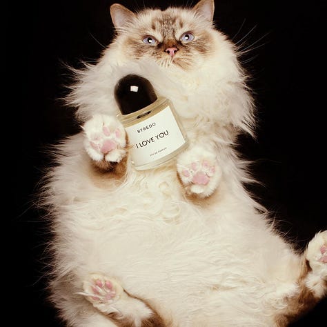
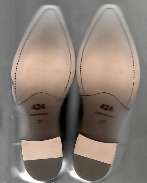
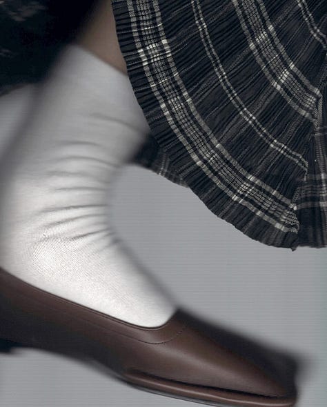
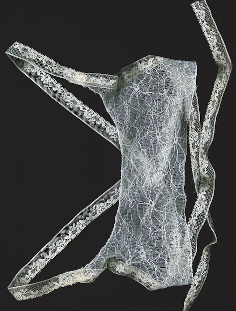
1. Scanning
Why it works: Scanners flatten objects in a way no camera can, giving everything a surreal, almost forensic quality. Textures become hyper-detailed, shadows turn soft and strange, and even basic items feel precious and archival. The imperfections, like dust and distortion, only add to the appeal.
Where it fits: Works perfectly for accessories (shoes, jewellery, lingerie) or beauty products, especially if you want to lean into a DIY or lo-fi aesthetic. It also fits brands playing with nostalgic or Y2K visuals (think Heaven by Marc Jacobs or Collina Strada).
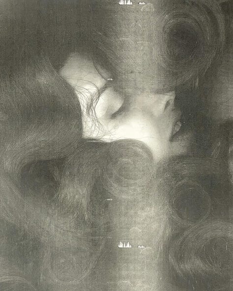
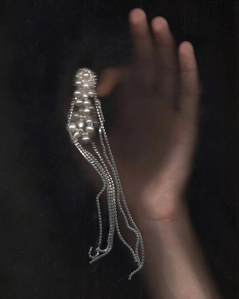
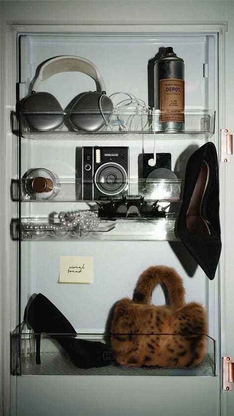
2. Placing product out of context (fridge edition)
Why it works: Fridges are domestic, ordinary spaces, so inserting fashion products or luxury items inside instantly adds contrast. It’s playful but also forces the viewer to focus on the product because it feels out of place.
Where it fits: Perfect for brands with an irreverent or playful tone (think Ganni, Jacquemus) or for social-first campaigns where you need an attention-grabbing, unexpected image.

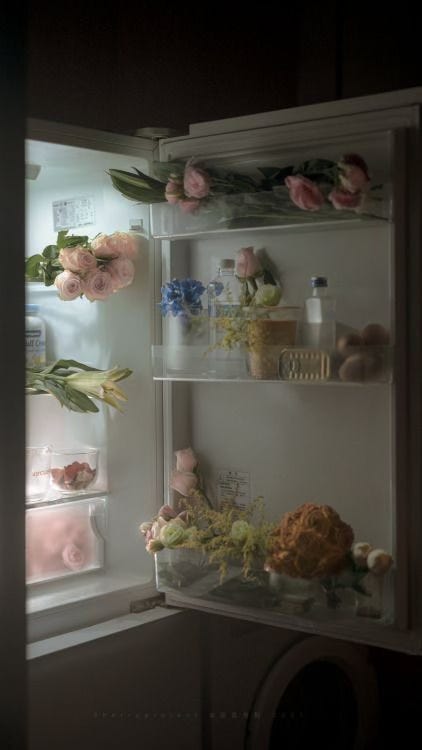
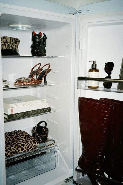


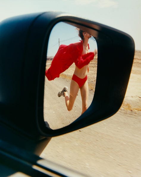
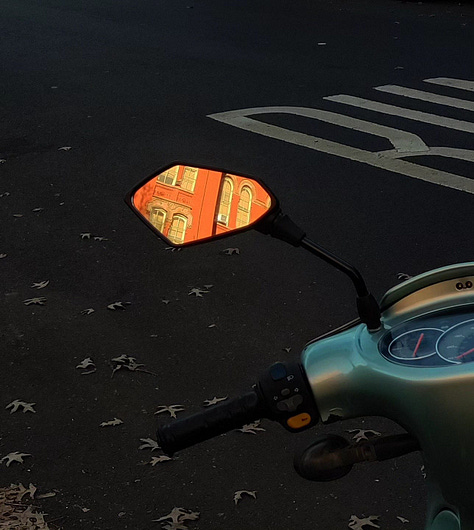
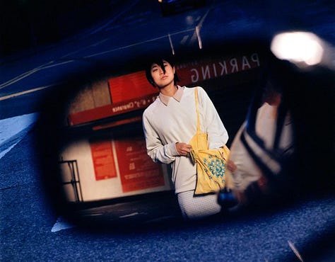
3. Vehicle mirror reflection
Why it works: It frames the product (especially accessories) in a way that adds natural storytelling. You instantly get hints of location, vibe, and context through the vehicle type and surrounding environment.
Where it fits: Works really well for sunglasses, watches, jewellery, or bags. It can lean high luxury (vintage cars on Lake Como) or indie (road trip vibes with a beat-up car mirror).



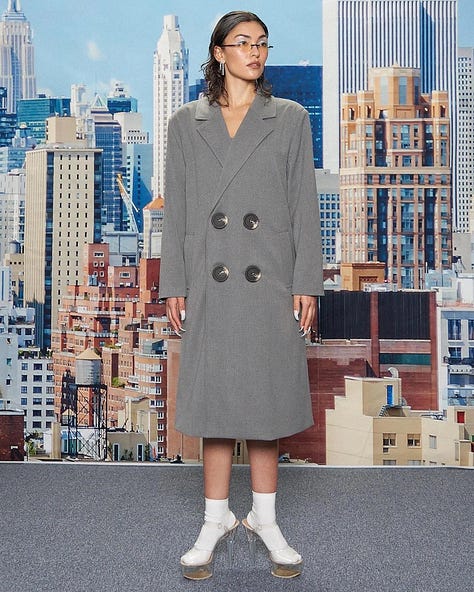
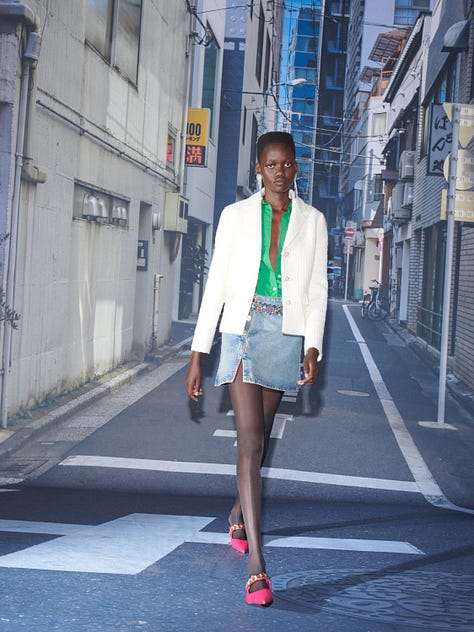
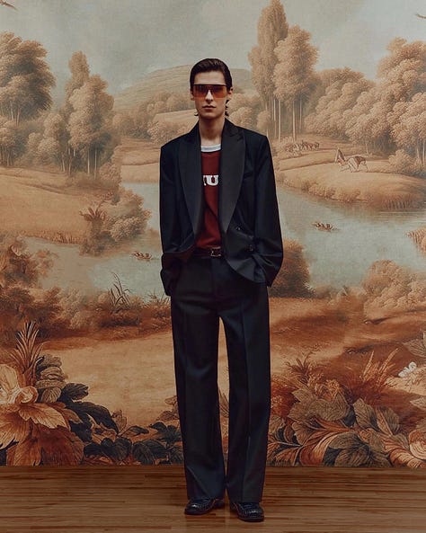
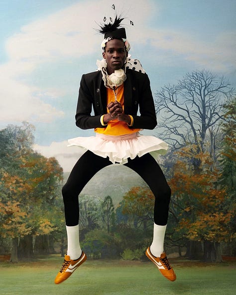
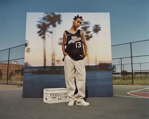
4. Printed ‘on location’ backdrops
Why it works: You control every element. You can shoot in front of an LA mansion or a Tokyo street without leaving the studio, and you get a nice disconnect between model and backdrop that feels slightly surreal.
Where it fits: Great for smaller budgets where travel isn’t an option, or for brands leaning into camp, kitsch, or intentionally artificial aesthetics (Diesel has been doing this a lot lately).

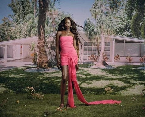
5. Textured plexiglass and backlight
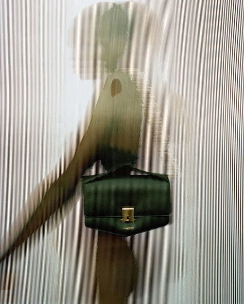
Why it works: It adds instant depth and texture to an otherwise simple studio shoot. You can control what’s visible, play with silhouettes, and keep certain areas blurred to create focus.
Where it fits: Ideal for more minimalist luxury brands (The Row, Jil Sander) or anyone wanting to make a simple product still-life feel elevated. Also works beautifully for beauty campaigns, especially fragrance.

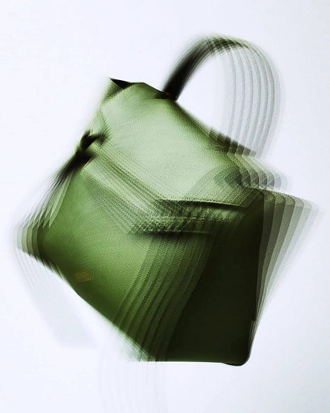


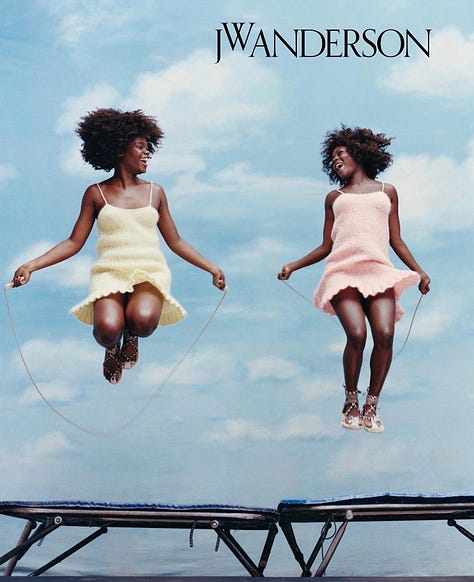
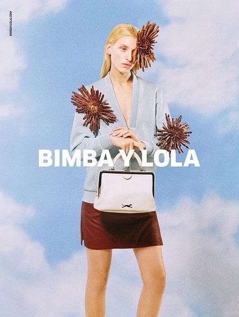
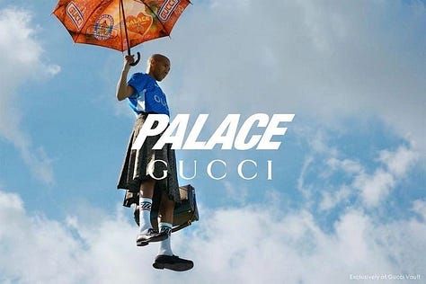
6. Blue sky backgrounds
Why it works: Blue skies instantly evoke optimism, escapism, and a sense of possibility. Whether it is a real sky or a printed one, it adds lightness to the image and creates a surreal contrast when paired with products or styling that feel more grounded or unexpected. It is a visual shortcut for hope and imagination, which makes even the most ordinary product feel more aspirational.
Where it fits: Perfect for playful brands that lean into irony or fantasy (think JW Anderson, Bimba Y Lola), or any campaign that wants to break out of the everyday and tap into a sense of freedom and creative possibility. Works well for fashion, beauty, and even lifestyle products where mood is everything.



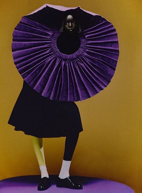
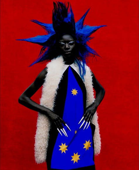
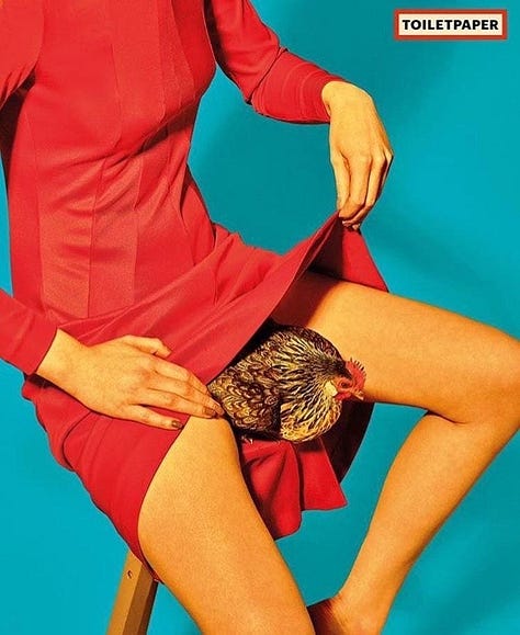
7. Colour blocking
Why it works: Strong blocks of colour create instant visual impact, even before the viewer registers the product. It’s bold, graphic and timeless, with a built-in sense of art direction that makes every shot feel considered. Whether it’s contrasting outfits against primary colour walls or styling in monochrome with a pop of clashing colour, it locks in attention.
Where it fits: Ideal for brands with a playful or graphic identity (think Marni, Jacquemus, or even Maison Margiela), but also works well for beauty campaigns where you want to highlight a single shade, or for brands leaning into editorial-driven campaigns where styling and set design take centre stage.


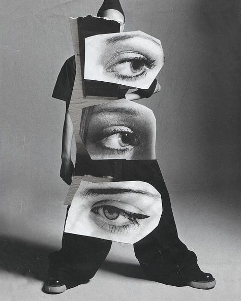
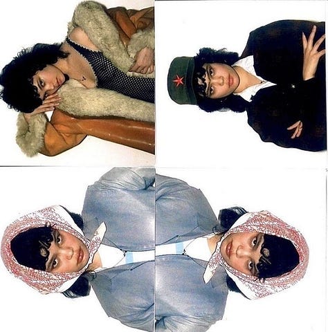
8. Analog collage portraits
Why it works: Cutting and layering printed portraits adds texture and makes images feel more personal and raw. The imperfections such uneven edges, torn paper can add emotion and break away from the usual polished fashion visuals. It also opens up room for surrealism, turning faces into abstract compositions.
Where it fits: Great for indie brands, zine-style editorials or campaigns looking for an anti-digital, DIY feel. It can lean art-school experimental (like early Margiela or current underground collectives) or be refined for luxury brands wanting to embrace craft and process (think Dries Van Noten or even Marni in their more playful moments)




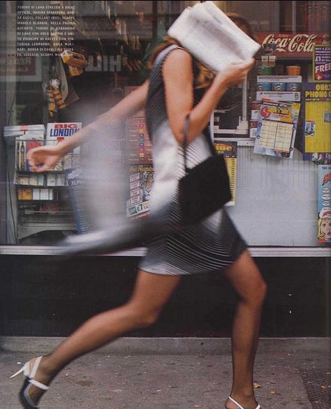
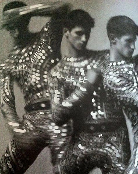
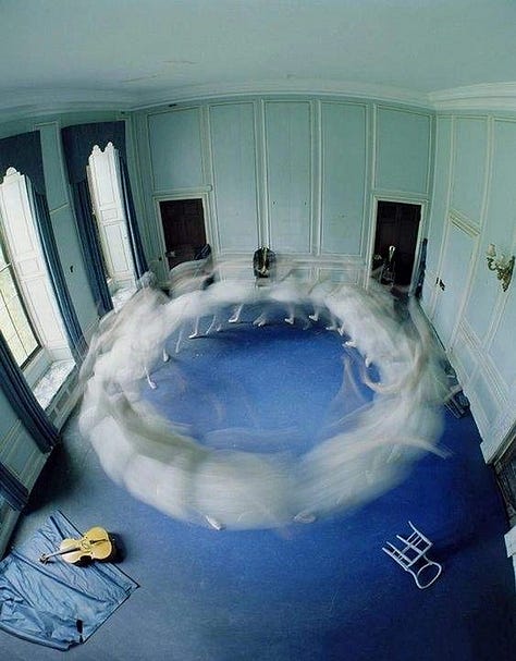
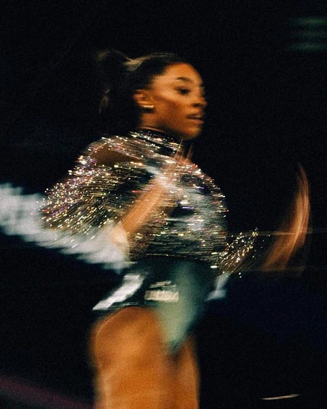
9. Adding action and movement through motion blur
Why It Works: Motion blur injects life into stills. It captures energy without over-explaining, making images feel spontaneous and emotional. It also adds texture, especially with shiny fabrics, sequins, or anything that catches light.
Where It Fits: Ideal for editorials focused on movement, nightlife, sports, or street scenes. It works for brands that want to feel human and unpolished or for fashion stories showing clothes in action rather than perfectly styled.


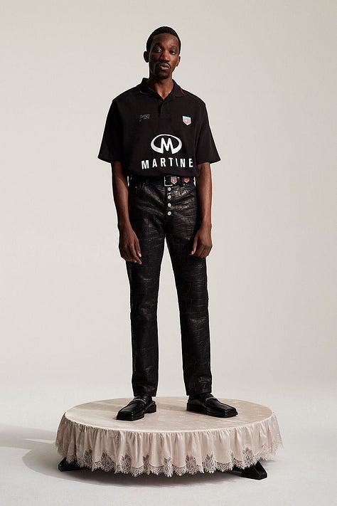
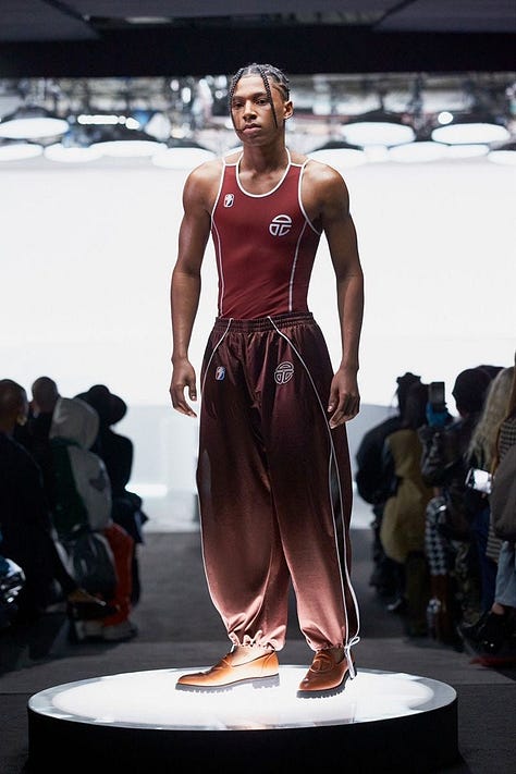
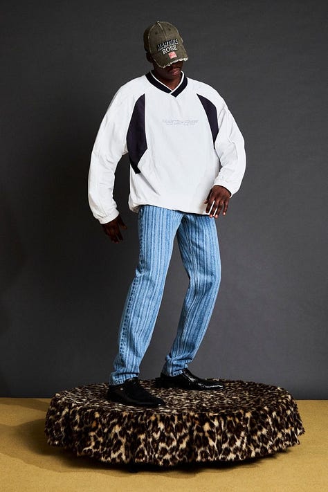
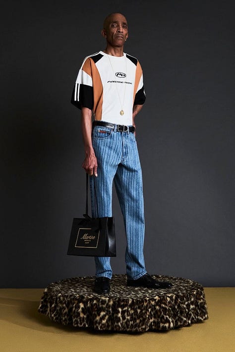
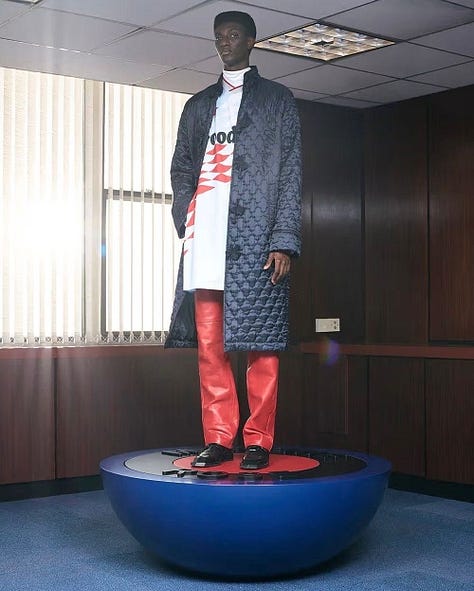
10. Platform set builds
Why it works: Platforms frame the model like a museum piece, giving the whole look a curated, intentional feel. It isolates the outfit from the background, making sure the focus stays on the clothes while adding a playful, offbeat vibe.
Where it fits: Works well for lookbooks playing with subcultures, nostalgia, or sportswear. Great for brands blending humour with strong styling, or even e-commerce that wants to feel more gallery than product shot.

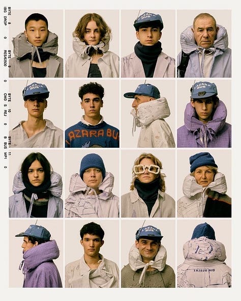
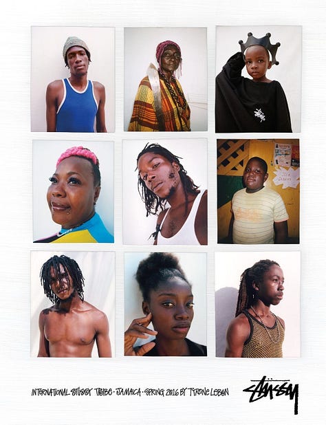
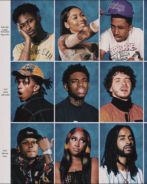
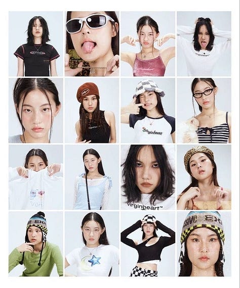
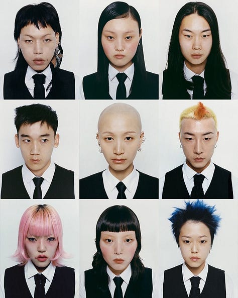
11. Framed portrait layouts
Why it works: Gridded portrait layouts are super effective for showing personality and variety in a clear, structured way. They let different characters or looks sit together while still feeling cohesive, and they nod to contact sheets, yearbooks, and early social media collages.
Where it fits: Perfect for campaigns showing diverse casting or different styling directions within a collection. Works for brands with a strong community focus, youth culture stories, or casting-driven editorials. Also fits streetwear, music mags, and subculture-focused projects.
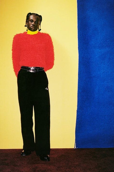
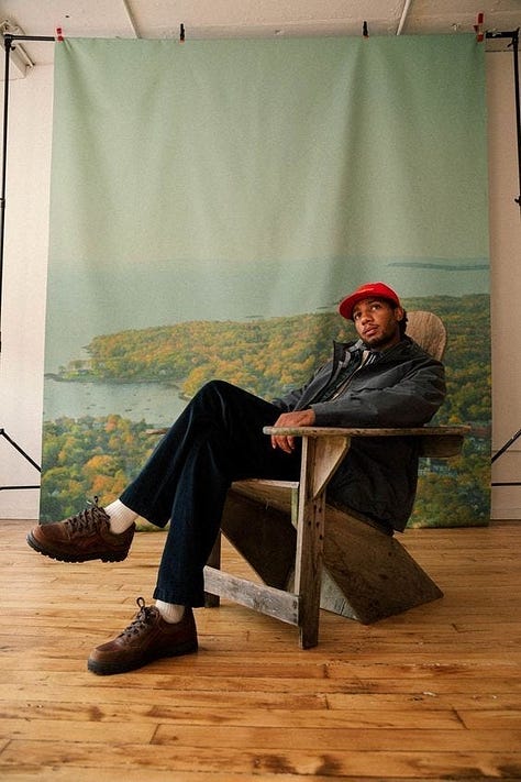
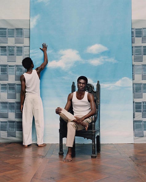
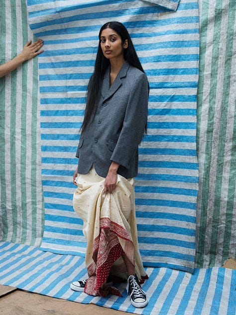
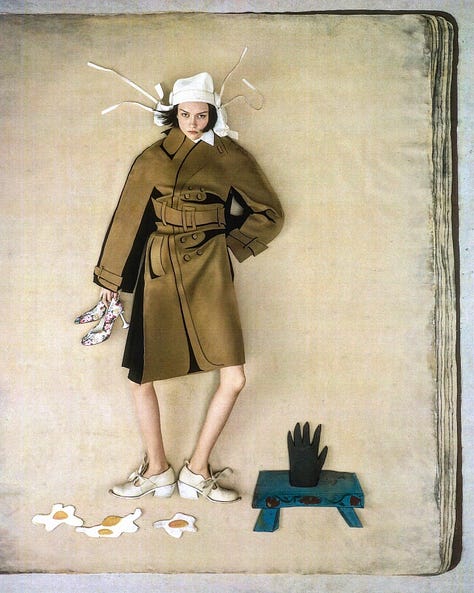
12. Incomplete backdrops
Why it works: Showing the edges of a set adds instant transparency, reminding viewers the image is constructed. That mix of real and staged feels modern and self-aware. It also adds depth, with the set becoming part of the story instead of just the background. It creates a layered tension between reality and set design, showing the artifice instead of hiding it.
Where it fits: Works for fashion campaigns that want to feel creative but not overproduced. Fits brands playing with nostalgia, DIY vibes, or referencing early editorial shoots. Also strong for identity-driven stories or brands blurring personal and fantasy spaces.


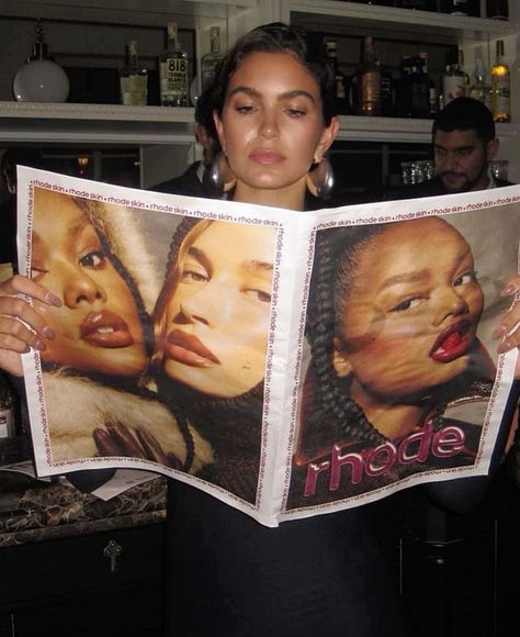
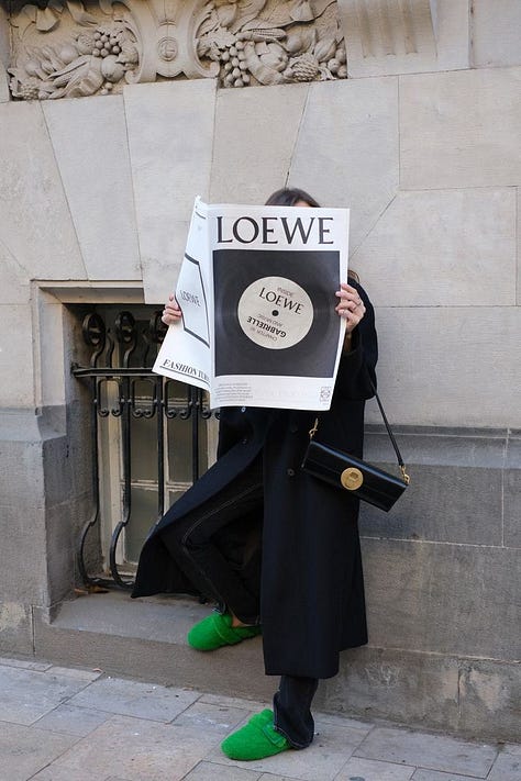
13. Branded newspapers
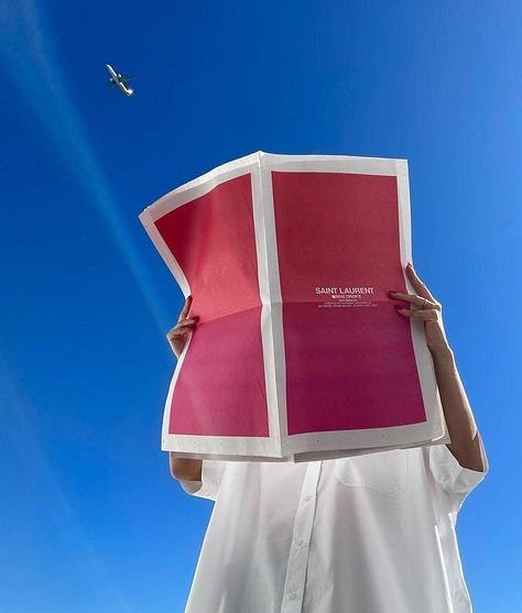
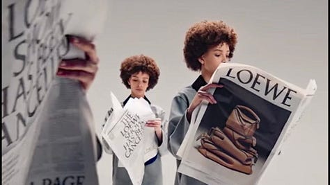
Why it works: Branded newspapers mix fashion and media in a way that feels collectible and intentional. They turn the campaign itself into a physical object people want to hold, flip through or even keep. It is a smart way to push messaging and typography without it feeling too much like a campaign asset. It feels editorial, but still fully controlled by the brand. You could play around with copy for announcements or campaign slogans.
Where it fits: Best for brands with a strong point of view or playful voice. Works well for product drops, seasonal campaigns or brand anniversaries where storytelling matters as much as the visuals. It fits brands that play between fashion, culture and commentary and want to create something people actually want to steal from a café table or take home from an event.


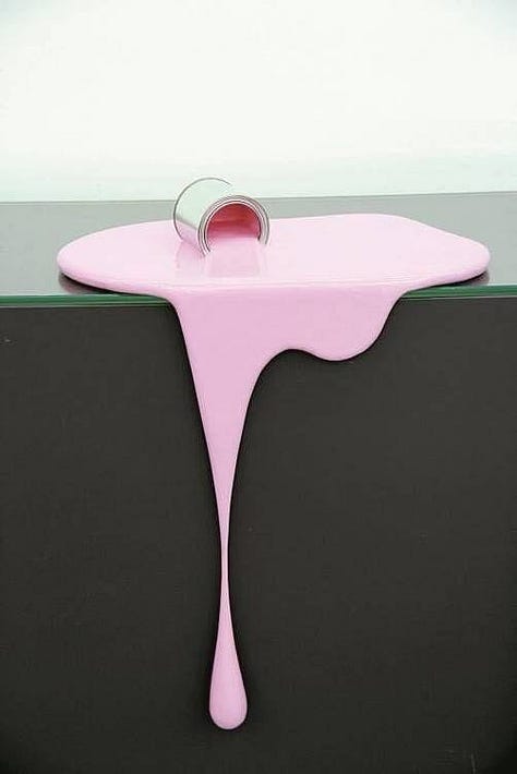
14. Intentional spilled mess
Why it works: It brings controlled chaos into a shot, making everything feel more tactile and less polished. Whether it’s melting ice cream, dripping paint, or metallic liquid, it creates texture and tension that instantly catches the eye. It also adds a sense of movement to still images, almost like you’ve caught something mid-action. Feels playful but also a bit destructive in a good way.
Where it fits: Perfect for beauty, especially when you want to mess with the idea of perfection. Works in product campaigns where you want to show a product in action without it being too lifestyle. It also fits well in anything leaning surreal, or campaigns playing with humour and exaggerated visuals.




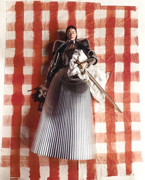
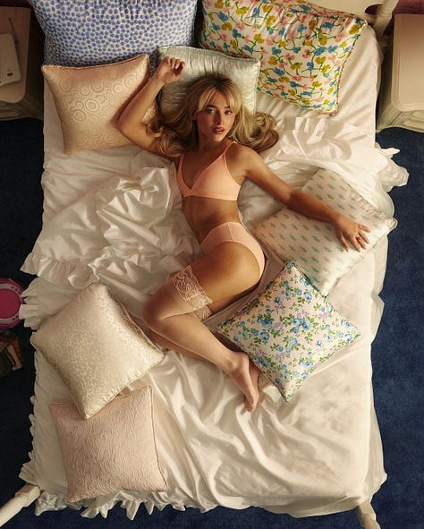
15. View from above
Why it works: Overhead shots feel voyeuristic, like you’re peeking into a private scene. They flatten the image, turning clothes, props, and people into one composition. It blurs the line between fashion and storytelling, making outfits feel part of the setting.
Where it fits: Great for editorials with strong storytelling, or lookbooks that want to feel a bit more candid and cinematic. Fits brands like Miu Miu or Acne Studios, but can also lean surreal for Balenciaga or Vetements if you play with proportions and styling.



Hope you got inspired by this first list of simple art direction techniques. The texts are just there to give a starting point, but ofcourse you can implement it in whatever way works for you even outside of fashion and beauty.
Love,
Zoe


This one was a nutritious winter soup! Thank you Zoe. Putting all the techniques together with a short description as to why and how was very helpful.
I love this so much. I’ve been seeing brands using incomplete backgrounds a lot lately and I think it’s such an effective way of selling costumers on a fantasy while being casual enough to not feel ostentatious