

Turning Loose Thoughts Into Tangible Ideas
How to move from a feeling to a concept that can be shared, pitched, and executed.


Every idea starts as a fragment (and you’ll need to train yourself to recognise that this is the start of an idea). A note scribbled in the margins of a sketchbook. A line overheard on the metro. A colour you can’t get out of your head. These fragments live in the background of our creative process, often dismissed as “not enough” to be a concept. Yet if you look at most strong campaigns, films, or editorials, the seed was rarely a polished vision. A loose thought that only became real through the act of shaping.
The danger is that most creatives are taught to polish too early. To jump straight from a spark to a “moodboard” that proves it belongs. But ideas aren’t born as 12-slide decks. They need space to stretch and mutate, to live in the mess between raw feeling and structured concept. The art director’s role is to bridge that gap: to take a blurry intuition and translate it into something others can see, feel, and eventually execute.
Today’s post is a deep dive/framework into turning loose thoughts into tangible ideas. What steps to exactly take to turn a feeling you can’t quite pinpoint into a vision and how to take it from there.
This post is exclusively for paid subscribers. As a paid subscriber you don’t only access this post, but also an archive of 110+ other posts that range from practical tips, essays, inspiration and real industry insights. You will also have access to the 30-day craft your art director’s DNA course.

10 Prompts to Build Your Art Direction Portfolio

This post is a little different. Someone shared in the chat how they were struggling to come up with imaginary briefs for their portfolio (Thank you Jenna Murphy from Layer Cake for this post idea!). The ideas were there, but they couldn’t figure out how to turn them into an actual task. I loved that message. It’s exactly what the chat is for. You…

From Feeling to Framework
The easiest trap is to confuse aesthetics with ideas. Saying “I want it to look like Juergen Teller capturing Kate Moss in the 90’s” is not a concept. Saying “I want the viewer to feel like they’ve stumbled into a moment they weren’t meant to see” is closer to one. The difference is that one references a style, the other proposes an emotion.
Start with the feeling. Write it down in the simplest terms possible: a mood, a tension, a question. It could be as vague as “a sense of safety in something chaotic” or as specific as “the atmosphere of a summer gym at night, when the fluorescent lights are too bright and the room feels both empty and alive.” Feelings are slippery, but they’re also the most powerful entry point. They shift the question from “what does it look like?” to “what do I want it to do?”
Another entry point is frustration. Pay attention to what bothers you, in your own life or in the wider culture, and then strip it down to the underlying human truth. Once you’ve named it, flip it. That flip becomes the concept. Instead of starting with aesthetics, you’re starting with tension, and tension is what makes an idea resonate.
Example: Growing up between identities as multi-racial (something I experience myself, coming from European, African and Asian descent), one frustration is how mainstream fashion often reduces identity to neat categories and culture is not allowed to be ‘mixed’. You’re asked to perform one side, while the others are ignored, leaving hybridity invisible.
The deeper truth is that identity isn’t split, it’s layered: it carries contradiction, coexistence, and codes that don’t translate neatly.
The flip could be a concept like: a campaign that visualises hybridity as collage rather than compromise, layered styling, clashing textures, unexpected casting pairings, showing the friction and richness of belonging to many worlds at once.
Collecting Without Collapsing
Once you’ve named the feeling, references come in, but they are never there to validate taste. The point of gathering is to test the spark. To ask: how does this hunch live across media, time, culture? Pull from film stills, sculpture, sports rituals, supermarket packaging. A fragment of a Wong Kar-wai film might sit next to a photo of 90s Dutch rave flyers, or an archival shot of a wrestling match. At this stage, breadth matters more than polish. Step away from the internet, gather an archive. Go to the library, scan or photograph images, find photographers and artists, read interviews. Just really feed the hunch with as much inspiration and knowledge as you can, so it can slowly come to life.
The mistake is collapsing too soon. If you lock into a single style too early, you flatten the idea before it can unfold. This is how sameness happens: references chosen for their aesthetic similarity rather than their conceptual friction. Allowing your research to hold contradictions gives the work more tension, more room to breathe. Which also means more time & inspiration for your brain to absorb and think about it.
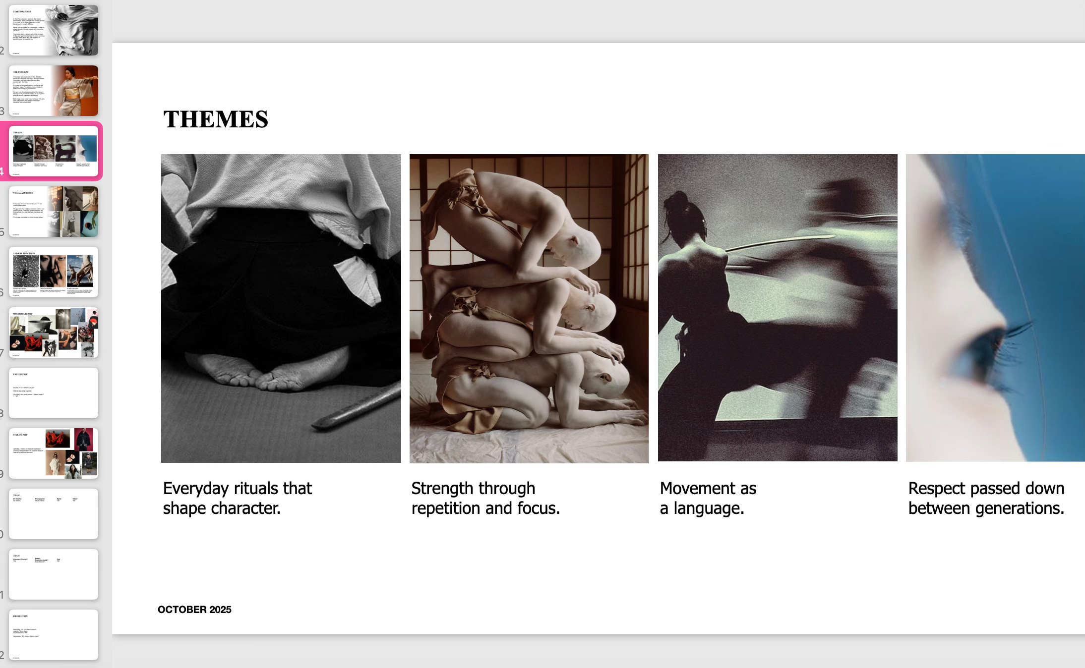
Finding the Recurring Cues
Look across what you’ve gathered. What repeats? What textures, colours, movements, or environments keep resurfacing? These are the cues that form the bones of your visual system. For example:
Colour: does the world lean into muted blues and greys, or saturated reds and metallics?
Materials: do you keep gravitating towards plastic surfaces, raw wood, glossy latex?
Movement: do bodies appear in stillness, repetition, or distortion?
Environments: are your references set in stadiums, kitchens, back alleys, liminal suburbs?
These recurring elements are more than aesthetic shorthand, they can later form the architecture of the idea. They move you from “a vibe” into a system you can actually direct. These 4 are just examples but recurring themes can be in format, graphics, fonts, textures, casting, themes, writing, locations, just anything that you notice really.
Framing the World
Now comes the translation. A reference board alone won’t carry an idea, it has to be framed as a world. This means giving it a strong title, a clear purpose, and a short write-up that blends the emotional and the practical. The title makes it memorable, the purpose explains why it matters, and the description lets others imagine themselves inside it.
Instead of a slide that just says “90s nostalgia,” frame it like this:
Title: The Gym After Hours
Purpose: To capture the tension of teenage boredom and intimacy in overlooked spaces, showing how even the most ordinary settings can feel cinematic when charged with emotion.
Description: A group of teenagers lingering in empty school gyms, where harsh fluorescent lights and plastic chairs become part of the set. The space feels both sterile and alive, suspended between play and loneliness.
This format transforms a style cue into a framework. The title gives the concept identity, the purpose roots it in meaning, and the description sketches both mood and tangible details. Suddenly the idea is no longer abstract to a creative partner, client, or stylist, because they can step inside the world, and understand its intention, and imagine how it might expand into a campaign. See how you already shape a world without seeing a single visual to this?
Building the System
Once the world is framed, the system follows. This is where the art director’s craft crystallises. Take the recurring cues and world story, then map them across the key building blocks:
Casting: what kind of faces, energies, or archetypes live in this world?
Styling: what materials, silhouettes, or textures bring the idea to life?
Set/Location: where does the story happen? How does the space reinforce the mood?
Typography/Graphics: what typeface or design system belongs in this world? Minimal grids? Handwritten scrawls? Overloaded cut-and-paste layouts?
Lighting: is it harsh, glowing, flat, or sculpted?
This is how loose thoughts become a concept you can actually build from. It creates a structure that others can understand and add to. Think of it as the foundation for a creative brief, something stylists, photographers, set designers, and clients can all use as a starting point while still leaving space to push it further.
Why So Much Effort?
The industry is oversaturated with aesthetics but starving for ideas. Scroll through campaigns and you’ll see the same filters, poses, references, all recycled because they were never anchored in a deeper feeling. When a loose thought is left as a “vibe,” it dissolves into sameness. But when it’s translated into a system, it has the power to shape an original visual language.
This is also what separates art direction from pure styling or photography. It’s not about adding beauty on top, but about defining the blueprint underneath. The ability to turn fragments into frameworks is the difference between a pretty shoot and a world audiences want to step into.
Tools to Practice
Idea Journal: keep a running list of loose thoughts, feelings, sentences, sensory fragments. Review regularly.
Reference Expansion: for each idea, collect from at least three different fields (e.g. sport, cinema, sculpture).
Cue Extraction: highlight recurring colours, textures, poses. These are your building blocks.
World Sentence: write two lines that place the idea in a world. Who’s there, where are we, what does it feel like? Sometimes I also like the name it after song’s I love that give me a similar feeling or lyrics.
System Map: translate cues into casting, styling, set, graphics, and lighting.
Turning loose thoughts into tangible ideas is about craft and time. The fragments will always be there, fleeting, messy, unresolved. It’s the foundation for every single idea, innovation or experiment in the world. The work of the art director is to catch them, test them, and build worlds around them. That process is what turns “a vibe” into an image system that not only looks good, but also lingers.
I hope this newsletter inspired you to pay attention to the small hints of forming ideas in your mind. Note it down, don’t be scared of judgement because you only write things down for yourself in a way that only needs to make sense for you. Try to go through your list of things and pick one starting point and ‘force’ build it out to something bigger.
Love,
Zoe
The Art Direction subscribers chat is available for every free subscriber. If you have any questions, please drop it in there and I will answer you, try to help you or write requested articles. You can also always message me on DM or Instagram.
If you’d like to support my Art Direction newsletter and help me keep dedicating time to writing and sharing more insights, you can buy me a coffee. Every bit of support helps me stay focused on creating content I love and bringing fresh ideas to you. ❤️
Follow Art Direction on Instagram for inspiration on your feed.

Chalk full of valuable insights as usual. Thank you Zoë!
I adore this article and your advice!